Colorizing ClipArt: Using Gradient Maps
by Roy Winkelman
This week as I was creating a colorized illustration for our TIM website, I thought it was time to add a second installment to a series on colorizing clipart. The first post was “Colorizing ClipArt: Intro to Blending Modes”. That first post included information about coloring clipart more for its instructional value. Today’s post is about how to use gradient maps to add color simply to create an artistic effect.
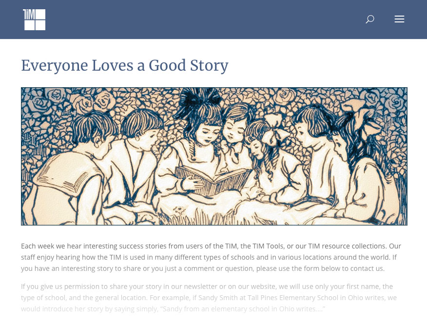
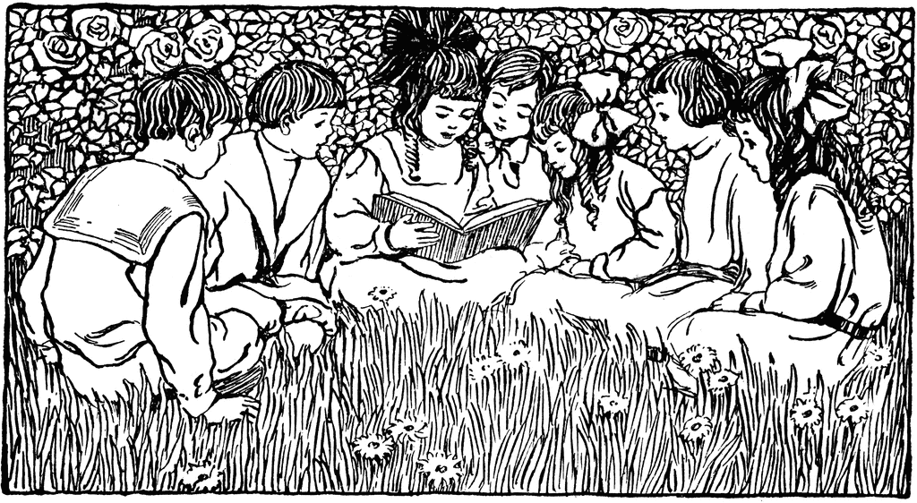
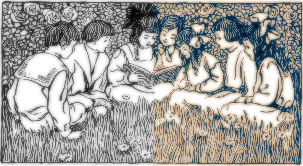
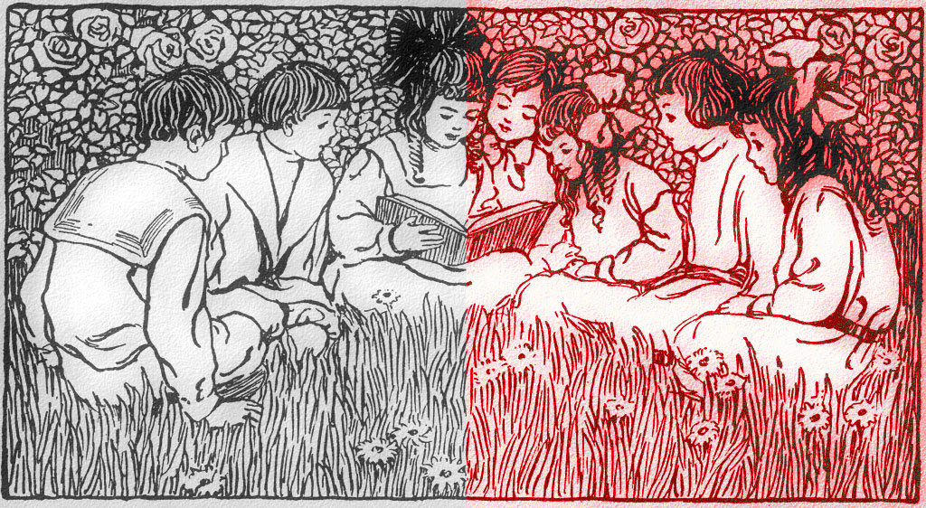
I needed to create an illustration for a new page on our Technology Integration Matrix site called “Everyone Loves a Good Story”. I wanted a warm, friendly illustration that still went with the blue color scheme of the TIM website. When I did a search on our ClipArt ETC website for the word reading, I found an illustration I thought had potential. It would crop well for the sort of banner-like space I was trying to fill, but the stark black-and-white image didn’t convey the feeling I wanted, so I decided to use a trick I developed a long time ago for softening and colorizing clipart.
So you can see where this post is going, below is a screenshot of the finished page followed by the illustration I started with.
Finished page:
Original black-and-white image:
The technique is really a very simple three-step process. First, set the color mode to RGB. Second, do something to the image to change it so that it includes a range of greys. Third, apply a gradient map to the altered image. That’s it. Steps 1 and 3 just take a few seconds to do.
However, there are lots of ways to accomplish step 2, so this post will ramble on (and on). I’m giving you a half dozen options for step 2, but just keep in mind that you only need to do one of them. That’s the trouble with being a former art teacher–I like to give LOTS of choices! Ready?
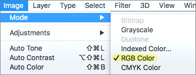
Step 1: Set the mode
Some clipart images you start with may be grayscale (black, white, and grays only) or indexed color (a very limited set of colors). You won’t be able to add the colors you want until you change the file to accept all colors. This setting is called the “mode.” You’ll need to change the mode to RGB, so you’ll have all the colors to work with. You’ll find this setting in different places depending on the graphics program you are using. In Photoshop, this is what the setting will look like:
Step 2: Create some greys
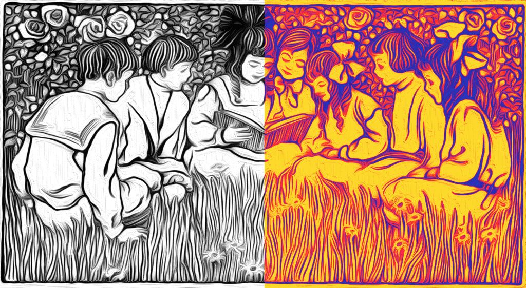
Option 1: Just blur the image
Filter > Blur > Gaussian Blur…
The left side of the image shows what it looks like with a slight blur. The right side shows what it will look like after you apply a gradient map. The path shown in italics for each option is where you will find the particular filter in Photoshop. The path may be different if you are using some other graphics program.
Important note: For most images, you’ll probably want to maintain the original lines to some degree. The easiest way to accomplish this is to run the filter, then use the “Fade Filter” option under the Edit menu to bring back some of the lines. Advanced users will probably want to duplicate the layer before running the filter and then play with various layer opacity settings to achieve the desired balance between the filter effect and the original line image.
Option 2: Try one of the special blur filters like motion or radial blur
Filter > Blur > Radial Blur… > Zoom

Option 3: Oil Painting
Filter > Stylize > Oil Paint…
Remember: In step 2, we’re just running filters to create some greys which you see on the left side of each image. The color on the right is merely an example of what one particular gradient map would look like. In step 3, you’ll be able to select any color gradient you want for your image.
Option 4: Cutout Filter
Filter > Filter Gallery… > Cutout > Edge Simplicity = 5
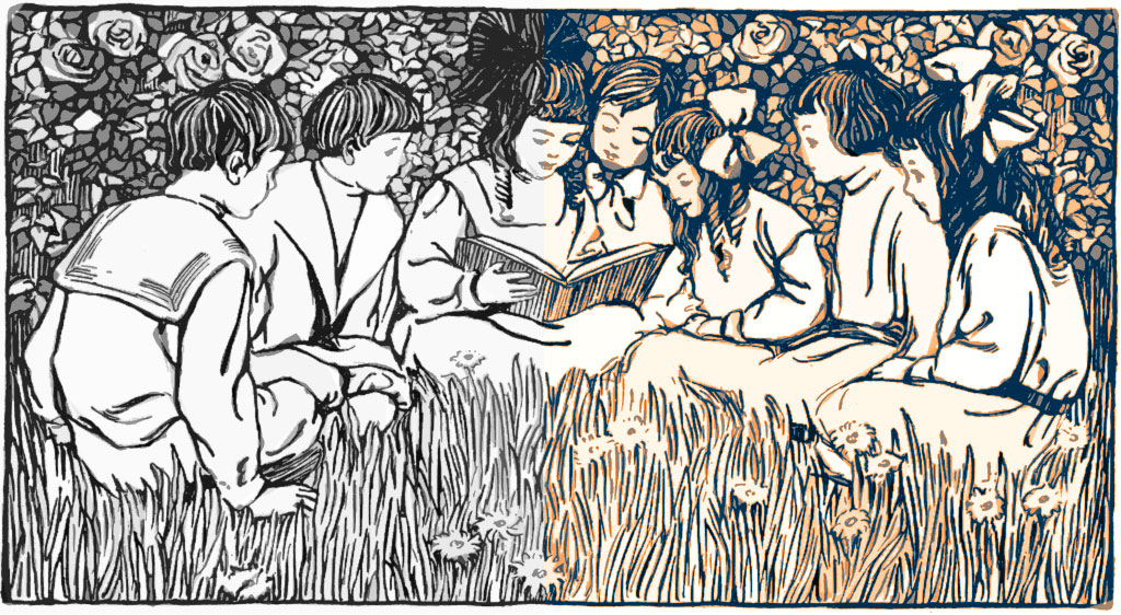
The cutout filter is great for creating related background shapes, however it’s not at its best for images such as this one with faces. By increasing the edge simplicity setting, you can add large abstract shapes to your illustration.
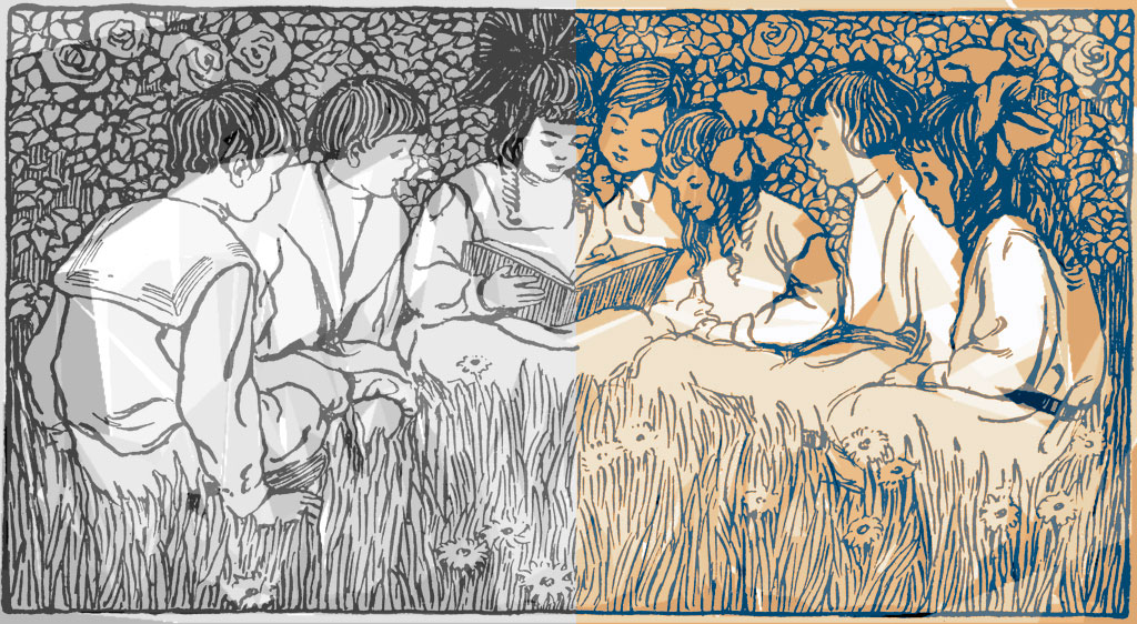
Option 5: Extreme Cutout Filter
Filter > Filter Gallery… > Cutout > Edge Simplicity = 8
Option 6: Combination Effects
Slight blur followed by Filter > Filter Gallery… > Texturizer > Sandstone
Any combination of filters that adds a range of greys to your black-and-white image will work. Once you’ve added greys, it’s on to step 3.
Step 3: Apply a Gradient Map
The last step is to colorize the image. Select Image > Adjustments > Gradient Map… Here you will find a selection of gradients that will map to the range of greys in your image. Select the one you want and voilà, your image now has color!
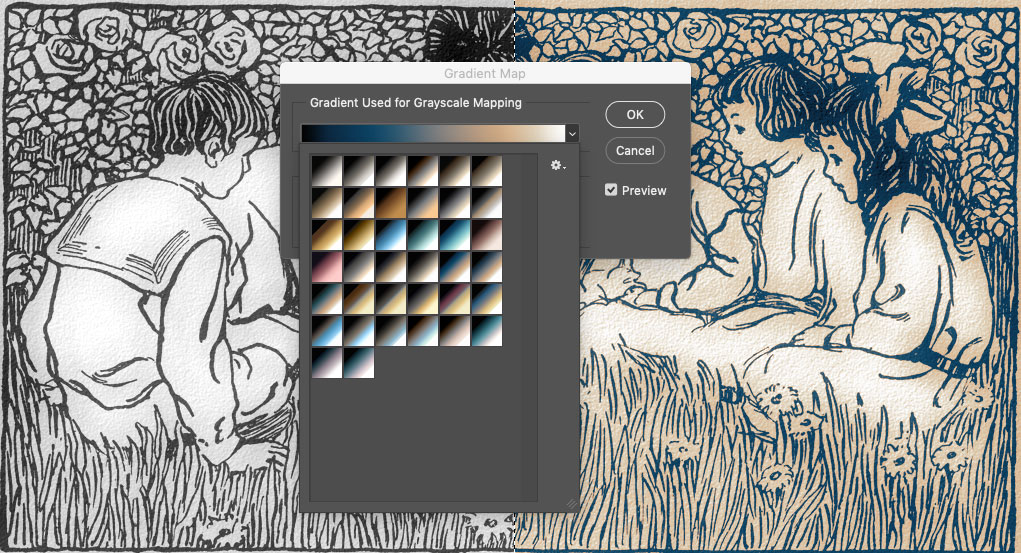
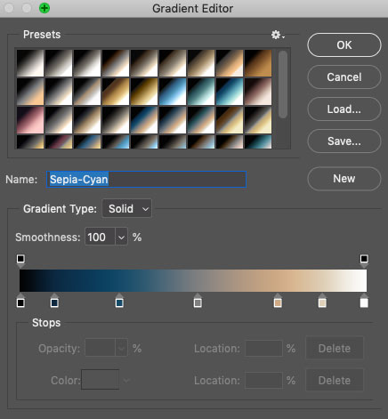
If you poke around in the Gradient Map panel, you’ll find that you can switch out gradient sets until you find one you like. And if there isn’t one you like, you can always create your own gradient in the Gradient Editor to apply to the image.
Happy colorizing!
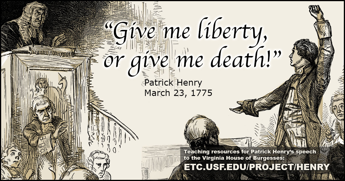
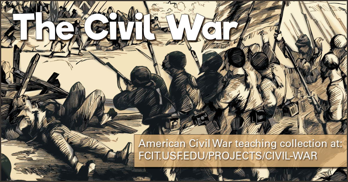
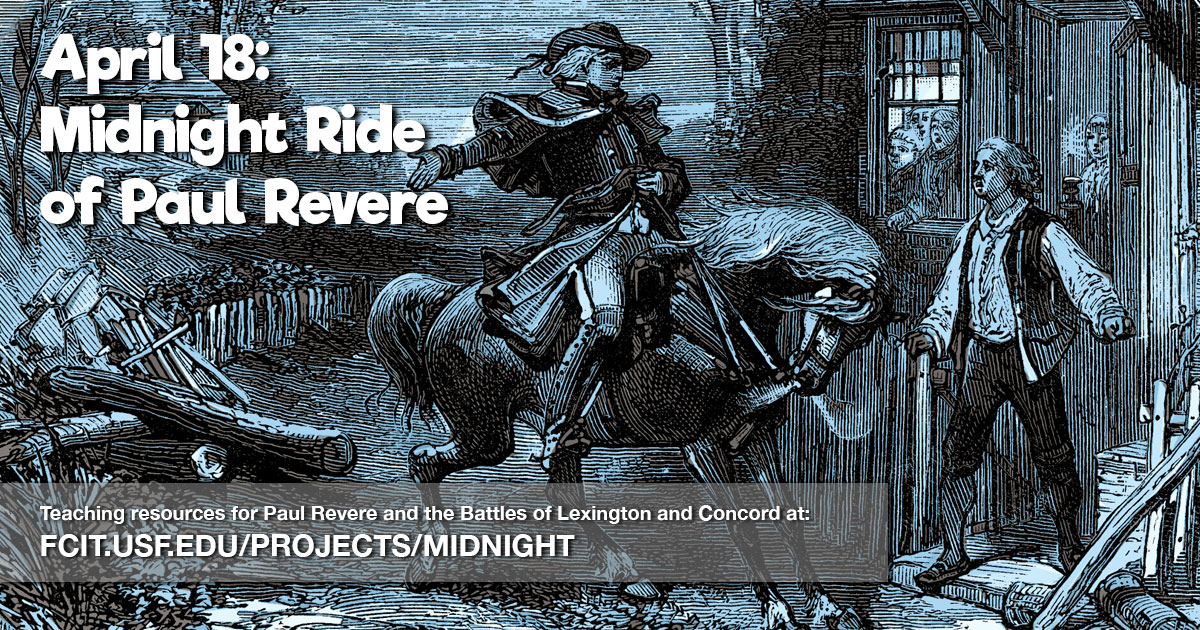
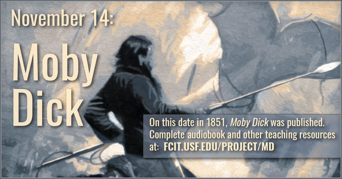
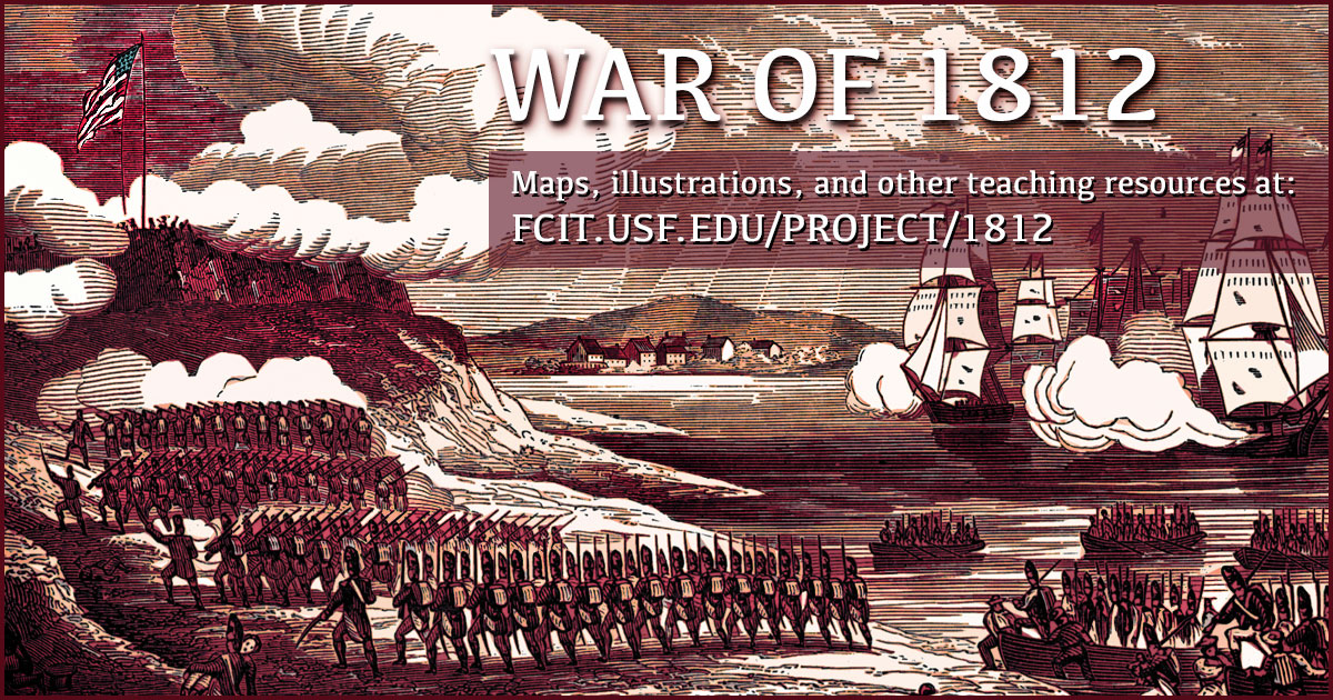
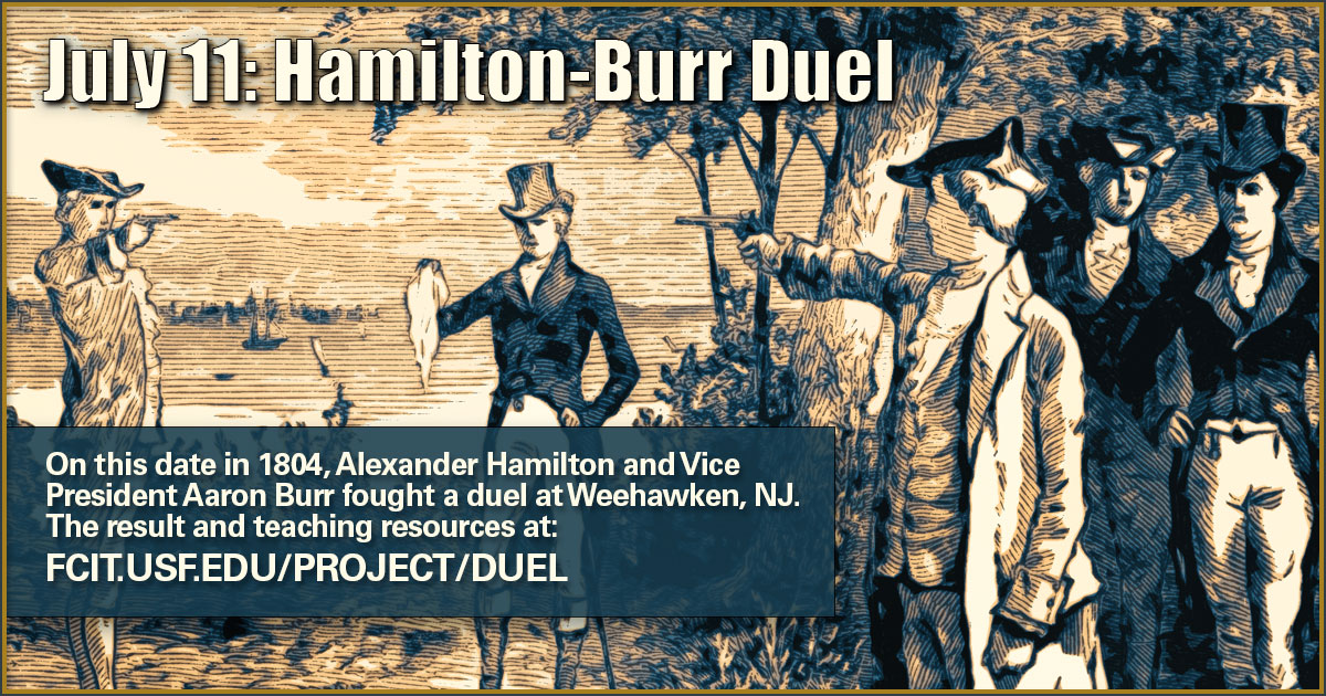
A few more examples
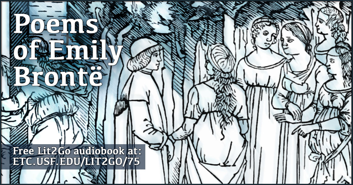
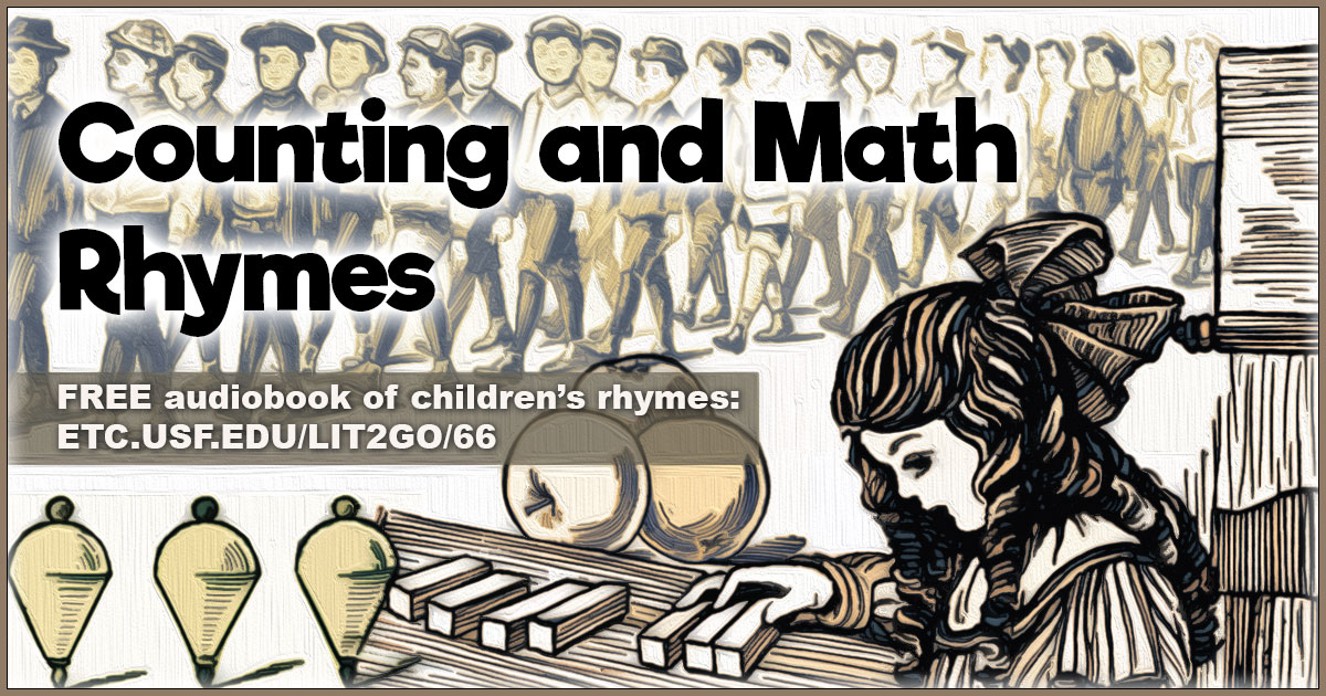
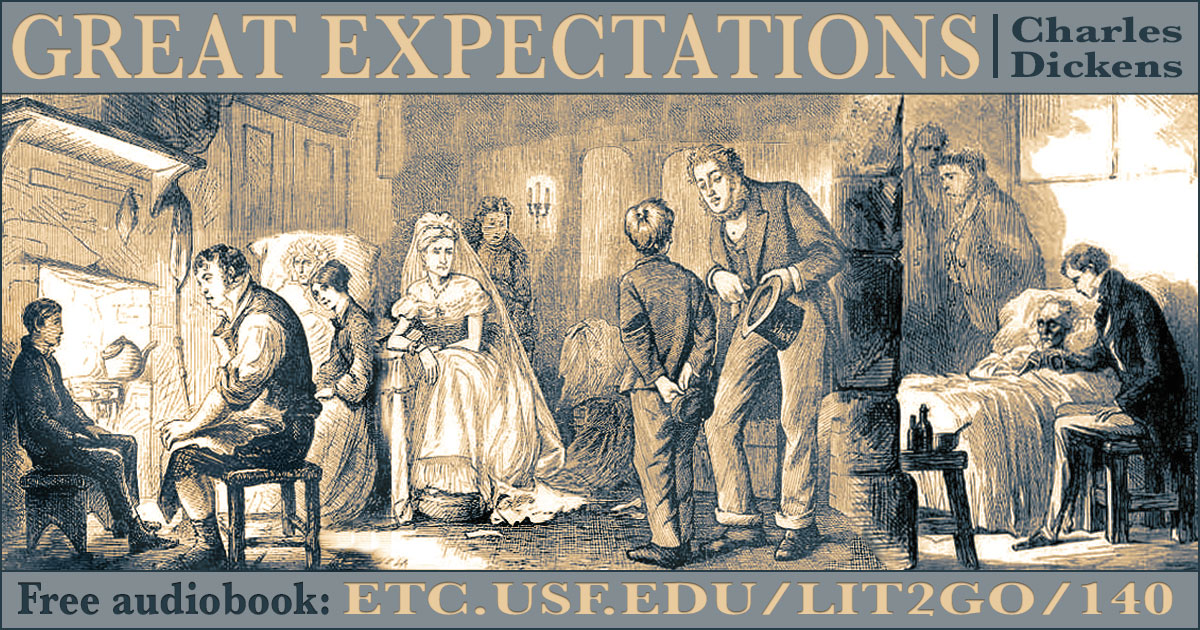
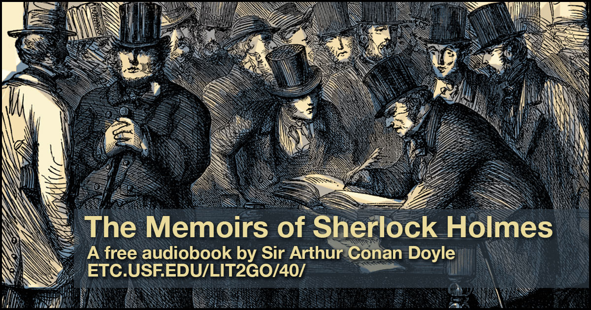
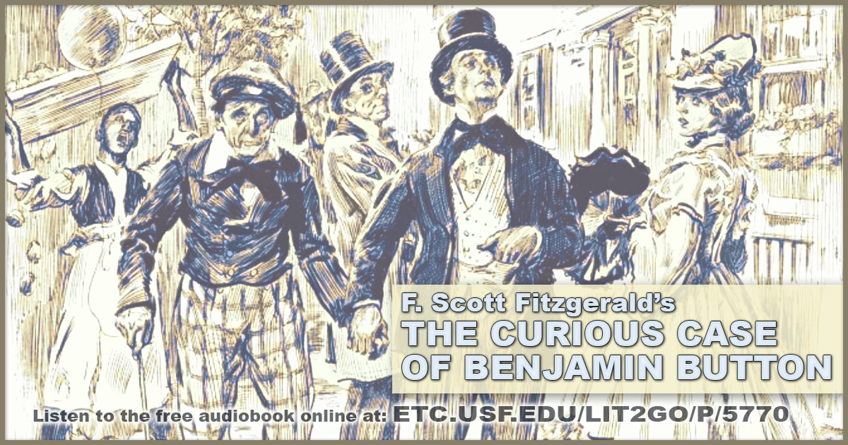
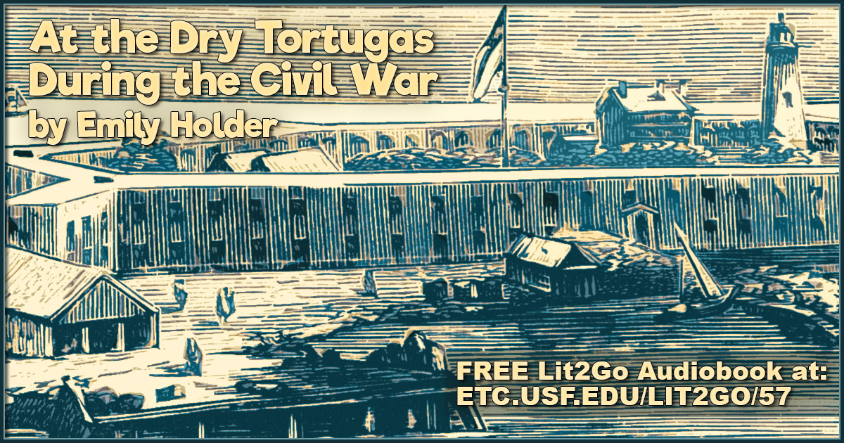
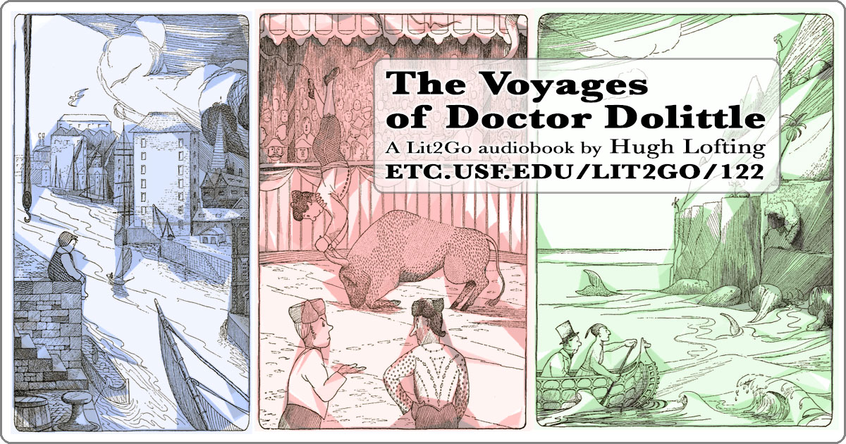
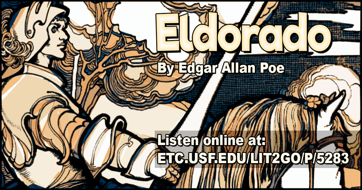
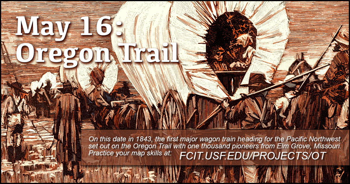
FCIT has created over 100 “teaching collections”. Each collection brings together related resources from FCIT’s varied websites. Since I intend for these collections to be shared out via social media, each collection includes a 1200 by 630 pixel banner that includes the collection title and URL. Here are a few sample banners that use the gradient map trick. Clicking on any thumbnail will enlarge the image so you can better see the gradient areas.
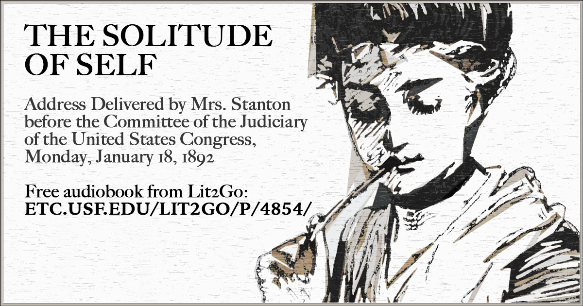

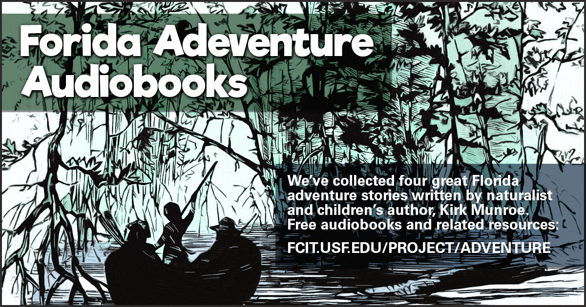
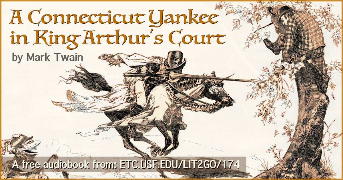
I’ve also used the technique to create many of the share banners for our Lit2Go collection of free audiobooks.